For Dashboard Users Styling
Friday, March 15, 2019 10:27 PMStyling
Nodes and relations can be styled using the [Styles] dialog (a Function of type :UserStylesView) that is accessible from the button on the User panel.
Legend
When the Styles form is opened, it automatically displays all styles that are used for the all nodes in the active NetworkView(s).
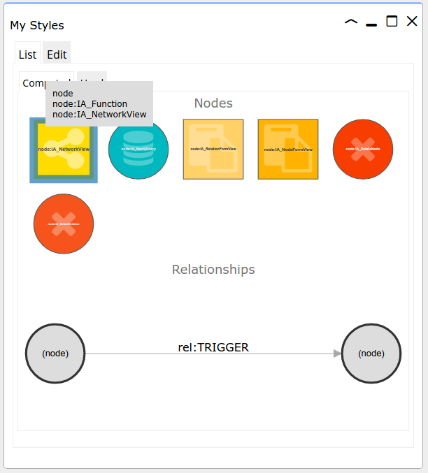
Node and relation styles are applied in a cascading manner. To view which styles are applied for a specific type of node or relation, switch to the "Computed" tab, and hover over a node.

The computed styling of :IA_NetworkView node in the image is derived of three styles: node:, node:IA_Function and node:IA_NetworkView, because these three styles have selectors that match with the :IA_NetworkView node. After all, it is a node, and it has, besides the IA_NetworkView label, also a IA_Function label.
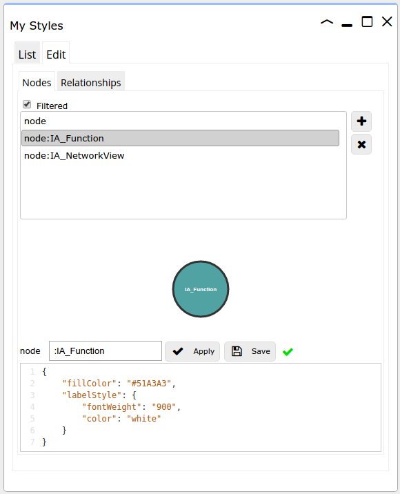
If you now click the node in the Styles form, the three relevant styles appear in a list. Each of them has a styling definition in JSON format. The styles are applied in the order that they appear in the list.

Editor
The full lists of styled selectors for nodes and relations are accessible via the Edit tab.
You can add your own selectors, for which you can define your own styles. Some examples:
| Selector | Description |
|---|---|
node: |
applies to any node |
node:MyLabel |
applies to any node with a :MyLabel label |
node[myParam] |
applies to any node with a .myParam property |
node[myParam=abc] |
applies to any node with the .myParam property having the specific value 'abc', or |
node[myParam=Abc Def] |
applies to any node with the .myParam property having the specific value 'Abc Def' (case-sensitive) |
node:MyLabel[myParam>5] |
applies to any node with a :MyLabel label and for which the .myParam property value is greater than 5. |
rel: |
applies to any relation |
rel:MYRELTYPE |
applies to any relation of type :MYRELTYPE |
You can move the selectors up and down to influence the order in which the styles are applied. The words node and rel should be omitted in the edit box.
To test the styles, click [Apply] and then, to save the styles, click [Save].
Node styles
The available node styles (and their defaults) are:
{
	"display": "circle",                              // circle|square|rectangle|triangle
	"width": 80,                                      // in pixels
	"height": 80,                                     // in pixels
	"fillColor": "white",                             // html colour
	"opacity": "1",                                   // 0 - 1
	"lineColor": "black",                             // html colour
	"lineWidth": "2px",
	"lineOpacity": "1",                               // 0 - 1
	"label": "(%).properties.name",                   // caption, e.g. (%).id or (%).properties.name
	"labelPosition": "center",                        // top|left|bottom|right|center
	"iconColor": "black",                             // html colour (not IN CE)
	"iconClass": "fa fa-female"                       // font awesome class, e.g. fa fa-female, see https://fontawesome.com/icons for reference
   	"image": "(%).properties.image",                  // image as node background
	"labelStyle": {                                   // caption styling
		"font": "25px Open Sans Condensed, sans-serif",
		"fontWeight": "5",
		"color": "black",
		"stroke": "none",
		"strokeWidth": "1"
	}
}
Relation styles
The available relation styles (and their defaults) are:
{
	"fillColor": "#999",                              // html colour
	"width": 4,                                       // width in pixels
	"label": "(%).type",                              // caption, e.g. (%).type or  (%).properties.weight
	"toDecoration": "none",                           // end decoration
	"marker": {                                       // marker styling
		"display": "arrow",
		"width": 10,
		"lineWidth": 1,
		"color": "grey",
		"fillColor": "grey"
	},
	"labelStyle": {                                   // caption styling
		"font": "15px Verdana",
		"fontWeight": "0.1px",
		"color": "black"
	}
}