 Graphileon Documentation
 Graphileon.com
For Dashboard Designers Reference LayoutView
Tuesday, June 9, 2026 4:27 PMLayoutView
Label: :IA_Function
Property: type: LayoutView
Inherits from: Function and View
The LayoutView Function allows users to display multiple Views simultaneously. It divides the workspace into horizontal or vertical panels with tabs in each one to see, organize and switch between different views efficiently. Each panel can be resized manually.
The View is based on Docking Layout from Smart HTML Elements
Function parameters
| Key | Description | Default value | Possible values |
|---|---|---|---|
$layout |
The initial layout description | {} |
Object |
#actions |
List of update actions to be performed on LayoutPanel items |
[] |
Array of actions (documented bellow) |
Layout description
The $layout description can contain the following types of elements
LayoutGroup
Is used to split an area horizontally or vertically between multiple LayoutPanels or other LayoutGroups. A LayoutGroup should be the root element of the $layout parameter.
| Key | Description | Default value | Possible values |
|---|---|---|---|
type |
Type of layout element | LayoutGroup |
|
orientation |
A string value indicating the orientation of the Splitter group | vertical |
horizontal / vertical. |
size |
Sets the size of the item in pixels or percentages | string, number |
|
items |
A collection of LayoutPanel or LayoutGroup definitions |
{} | |
resizeMode |
A string indicating the resize mode. | adjacent |
'none', 'adjacent', 'end', 'proportional'. |
resizeStep |
A numeric value that determines the step of resizing | 5 |
number |
liveResize |
Determines if splitter resizing happens while dragging or not | false |
boolean |
LayoutPanel
A LayoutPanel holds one or more Tabs
| Key | Description | Default value | Possible values |
|---|---|---|---|
type |
Type of layout element | LayoutPanel |
|
autoHide |
a boolean property that determines if the LayoutPanel is autoHidden | false |
Boolean |
autoHidePosition |
determines the autoHide position of the item if autoHide property is set |
left |
top, bottom, left, right |
dropPosition |
Determines the possible positions for the item at which a new item can be dropped as a result of dragging | string array containing all possible values |
top, bottom, left, right, center, header, layout-top, layout-bottom, layout-left, layout-right. Positions with the layout prefix reflect on LayoutPanelItems that are children of the LayoutPanel |
label |
the Label of the LayoutPanel window | String |
|
tabPosition |
Determines the position of the Tab labels inside the LayoutPanel | top |
top, bottom, left, right |
headerButtons |
an Array of strings that define the buttons in the header section of the DockingLayout item | ||
tabCloseButtons |
a boolean property that Enables or disables the close buttons inside each Tab item label inside the DockingLayout item | false |
boolean |
locked |
Locks the size of the item and does not allow resizing via Splitter bars | false |
Boolean |
max |
sets the maximum size of the item in pixels | string, number |
|
min |
sets the minimum size of the item in pixels | string, number |
|
size |
sets the size of the item in pixels or percentages | string, number |
|
items |
a collection of objects. Each object defines the structure of a Tab. Each tab will will be uniquely identified by the key (in the items object.) |
Object |
Tab
The tab is the LayoutView element that contains other Graphileon Views.
| Key | Description | Default value | Possible values |
|---|---|---|---|
area |
Graphileon View area ID | String |
|
label |
a string representing the label of the Tab item | String |
|
selected |
determines if the tab is selected. By default the first added item to the LayoutPanel is automatically selected | Boolean |
|
draggable |
a boolean property that allows to disable the dragging of the Tab item | true |
Boolean |
For tabs the type should not be specified because it's implied.
Action descriptions
| Key | Description | Default value | Possible values |
|---|---|---|---|
type |
Action to be performed | update |
|
element |
a string representing key (in the layout description) of the LayoutPanel that contains the Tabs to be updated |
String |
|
data.tabs |
A collection of Tab descriptions (similar to LayoutPanel's items). Existing Tabs will be updated and missing ones will be created. |
object |
Outgoing triggers
Type: tabCreated
Occurrence: After a new tab is created in a panel.
Additional event properties (besides the inherited properties):
| Key | Description | Possible values |
|---|---|---|
data.panel |
Key of the panel that contains the new tab | String |
data.value |
Properties of the created tab | Object |
Type: tabUpdated
Occurrence: After a tab's properties are updated.
Additional event properties (besides the inherited properties):
| Key | Description | Possible values |
|---|---|---|
data.panel |
Key of the panel that contains the tab | String |
data.value |
Properties of the updated tab | Object |
Type: tabSelected
Occurrence: When a new tab is selected on a panel.
Additional event properties (besides the inherited properties):
| Key | Description | Possible values |
|---|---|---|
data.panel |
Key of the panel that contains the tab | String |
data.value |
Properties of the selected tab | Object |
Type: tabClosed
Occurrence: When a tab is closed on a panel.
Additional event properties (besides the inherited properties):
| Key | Description | Possible values |
|---|---|---|
data.panel |
Key of the panel that contained the tab | String |
data.value |
Properties of the closed tab | Object |
Type: lastTabClosed
Occurrence: When the last tab of a panel is closed.
Additional event properties (besides the inherited properties):
| Key | Description | Possible values |
|---|---|---|
data.panel |
Key of the panel that contained the tab | String |
data.value |
Properties of the closed tab | Object |
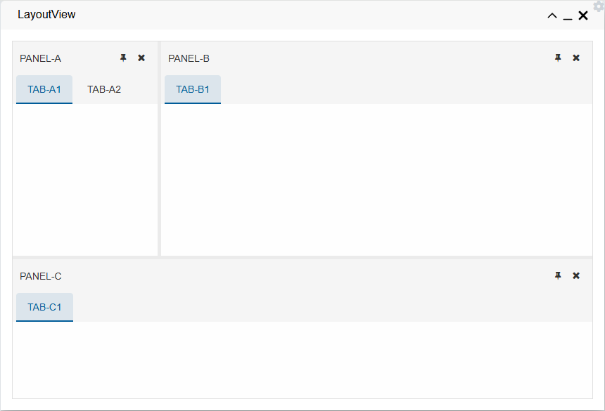
Example
evaluate({
  main: {
    type: "LayoutGroup",
    orientation: "horizontal",
    items: {
      groupA: {
        type: "LayoutGroup",
        orientation: "vertical",
        size: '60%',
        items: {
          panelA: {
            type: "LayoutPanel",
            size: '25%',
            label: "PANEL-A",
            items: {
              "tabA1": {
                label: "TAB-A1",
                area: "viewA1"
              },
              "tabA2": {
                label: "TAB-A2",
                area: "viewA2"
              }
            }
          },
          panelB: {
            type: "LayoutPanel",
            label: "PANEL-B",
            items: {
              "tabB": {
                label: "TAB-B1",
                area: "viewB1"
              }
            }
          }
        }
      },
      panelC: {
        type: "LayoutPanel",
        label: "PANEL-C",
        items: {
          "tabC": {
            label: "TAB-C1",
            area: "viewC1"
          }
        }
      }
    }
  }
})
area property of the tab, is the indicator for where the view with the same area property is going to be displayed.
The resulting layout from the example above is shown below: